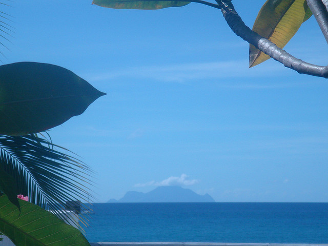
 A view of Saba, an island in the Netherlands Antilles from the Wyndham Sapphire Beach Club on Cupecoy Beach in Sint Maarten.
 A view of Saba, an island in the Netherlands Antilles from the Wyndham Sapphire Beach Club on Cupecoy Beach in Sint Maarten.
This demo is a partial look at CSS Filter Effects. To date, they are only available with the -webkit- prefix in some WebKit-based browsers.
You can use filter effects with CSS transitions too. I've used them here, as you may have noticed if you've reset the sliders.
Developed by Tiffany B. Brown. Released under a GPL license.
You can copy and paste this code into your CSS. Note that you do not have to define every function, just those whose values are other than the default.